- Name
- Jill Rosen
- [email protected]
- Office phone
- 443-997-9906
- Cell phone
- 443-547-8805
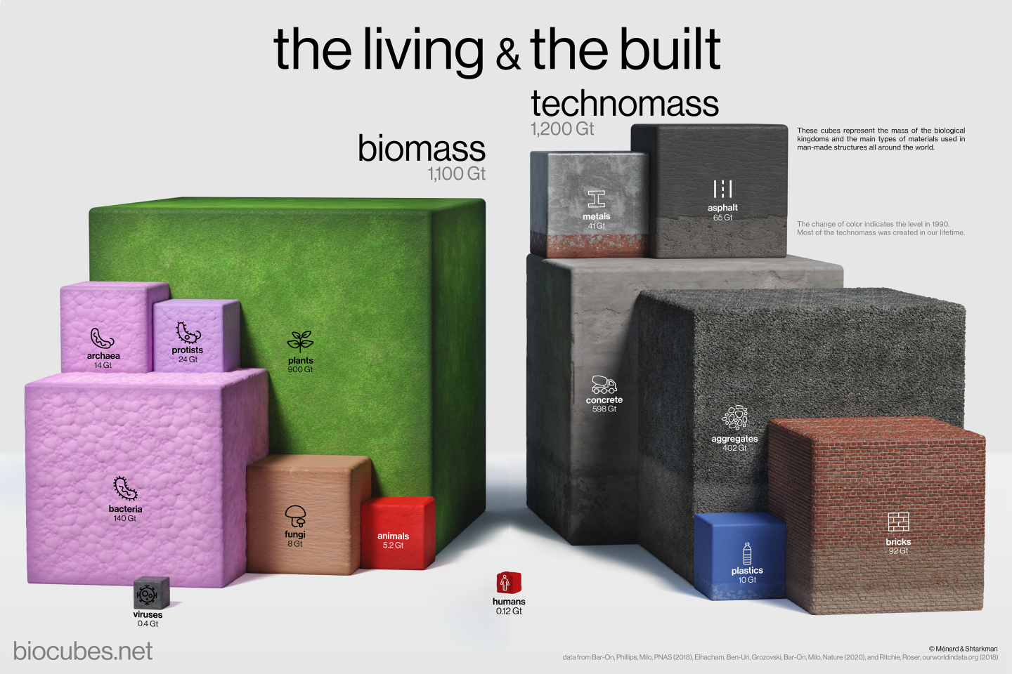
A new interactive visual depicts everything on the planet Earth, showing, with scientific precision and breathtaking profundity, how man-made things now outweigh all forms of natural life.
Created by a Johns Hopkins University physicist and a graphic artist, the illustration transforms complex data into a thought-provoking story about life on the planet that unfolds through each layer of the visual with increasing power.
Brice Ménard
Professor, Krieger School
"Being able to see all this information challenges our understanding of life on Earth and highlights the dramatic impact of human activities on the planet's ecosystems."
The interactive illustration called BioCubes depicts the mass of "the living and the built," allowing viewers to easily see and understand how biological and technological forms co-exist on the planet. It's available online, where certain illustrations can be downloaded for free.
Professor Brice Ménard, an astrophysicist and machine learning expert, decided to create the visualization because he felt numbers alone failed the story of what was happening on the planet—they were simply too large to be meaningful for most people.
"Being able to see all this information challenges our understanding of life on Earth and highlights the dramatic impact of human activities on the planet's ecosystems," Ménard said. "The mission with this visual was make this more intuitive and more easily graspable."
The infographic shows how the amount of man-made materials dramatically increased in mass since 1900, and now outweighs the planet's natural life forms. Most of that increase happened during our lifetime.
Ménard and co-creator Nikita Shtarkman, who earned a bachelor's degree in computer science from Johns Hopkins in 2019, also created the Map of the Universe, a map that displays the entire span of the known cosmos. Since its release in 2022 the map has been viewed nearly one million times.
The team hopes the visualization will inform and inspire.
"Scientists should not just make discoveries but also share knowledge," Ménard says. "Any viewer here will learn something or see the world from a new point of view. This is for everyone."